Assignment Two: City of Bottles
Hmm, well my first sketch received some pretty harsh criticism especially in the area I thought I had succeeded best in! (Of course!!) I thought my composition was pretty good, but it was considered one of the weakest aspects of my first sketch. (I of course was not so fond of the palcement of the main figure, but evidently my focal point wasn't too clear and if you divide my image up into quarters, some are pretty boring.

Okay, yeah, I can see that. Here they are upside down for a little distance:
 The one above is pretty boring! I definitely need some kind of horizontals in this section to break the strong vertical lines.
 This one is a little better, but could still use some more verticals especially in the bottom left corner.
 This one is pretty static! And the one below once again has strong verticals without much horizontal interest.
 Our new assignment was to do a better job. We had to do two different formats (one horizontal and one vertical). We also were required to use charcoal for one and graphite for the other. (Yikes - I am SO bad with charcoal - it is so messy and I never know where the point of the charcoal is, so I am real inaccurate with it. We could choose regular charcoal or vine charcoal - so I went for the vine charcoal.)
So here is the vine charcoal version.
Well, I think I did better, but I did more drawing than I expected (I was planning to leave more unrendered space on the paper.) Here is the image divided into quarters.
 The above two look pretty good and I like the one below too although it is pretty repetitive and could use a little more variety.
 The one below obviously needs some help.
 The bottom half of the image is pretty boring - I guess I need to add a shadow or a label somewhere.
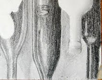
I was pretty tired, but thought I'd better start the graphite version. I did it much more quickly (one of my goals, but I can see I will need to do some work on it too.) The top
I think I did better compositionally here. There is definitely more movement in this quarter and a good variety of values.
 I like this one (below) too, although it is less active.

This one may be a bit too static, but it is still an improvement over the previous ones.
 This is the part of the picture I did last. I was getting tired. Can you tell? I guess I'll be working on it some more before class!

It is interesting that the right side of both images is weaker than the left side!


No comments:
Post a Comment