Tuesday, 26 September 2017
Updates - Knitting and Morning Glories
Here is my current knitting project:
I like the back (horizontal piece) better than the front.
Today the morning glories were very floriferous.
And zinnias in the garden:

Posted by
AfKaP
at
18:12
0
Responses
![]()
Labels: knitted vest, knitting, Morning Glories, Tripartite, zinnias
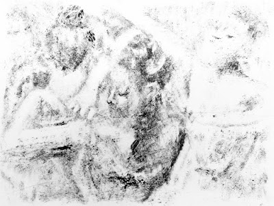
Applied Process Prints
Posted by
AfKaP
at
17:55
0
Responses
![]()
Labels: Flapper prints
Friday, 22 September 2017
I thought I couldn't grow morning glories...
Posted by
AfKaP
at
15:22
0
Responses
![]()
Labels: Morning Glories
Tuesday, 12 September 2017
Posted by
AfKaP
at
16:24
0
Responses
![]()
Labels: Prints 2017
Sunday, 10 September 2017
Ho Hum ....another self portrait assignment in another art class
A favorite assignment in Art classes seems to be self portraits. I know I should have assembled a collection of objects that represent who I feel I am, but I took what I thought would be the easy way out - yet another realitic representation. This time though I decided to use pen and ink (something Iam not so good at.) I did at least 4-5 images that were so awful that I couldn't bear to look at them. They made me look so old and ugly. Finally I got one that made me look like Anton von Leewenhoek, so, since I was thoroughly tired of drawing my self, I just pasted it into my journal and had done with it. Today I decided to try one more time. Here is the microbiologist:
I think this one is more accurate.
Yup, that is pretty much me!
Posted by
AfKaP
at
13:33
0
Responses
![]()
Labels: drawing, drawings, self portrait
Tuesday, 5 September 2017
Taking a Print Making class - first efforts
Posted by
AfKaP
at
17:33
0
Responses
![]()
Labels: print making


